The Ultimate Guide to Better Podcast Cover Art in 2026
Contents
Considering the cover art is the first thing potential listeners see, the design for your podcast brand is important — it pays to spend some time and effort getting it right. Just like with books and movies, good cover art lends some credibility to your podcast and increases the likelihood of potential listeners giving it a try.
No matter what platform you are hosting your podcast on (or even if you are using multiple platforms and podcast directories), podcast art is key to standing out from the crowd. Unfortunately, different platforms have their own sizes and specifications — meaning you can’t just pick a template and be done with it.
In this article, we will take you through everything you need to know about how to make podcast cover art. We’ll guide you through the dimensions needed for different platforms, things you should consider when it comes to your cover art, as well as some best practices to keep in mind.
Podcast Cover Art vs Podcast Logo
Your cover design is the artwork you’ll upload to podcast directories. It’s what your podcast listeners will see when they come across your podcast, and while they listen to an episode. This is a great opportunity to provide some insight into your content and pique people’s interests. Hopefully, enough for them to hit play.
A podcast logo, on the other hand, can simply be a part of your branding as a whole. It is still a visual representation of your podcast, but it can be used in other mediums like social media profile pictures, merchandise, etc. It’s another way for listeners to identify your brand.
iTunes, specifically, also has what are referred to as Channel Icons and Logos. While Icons are graphic symbols representative of your podcast or brand, Logos are text-based images that will be overlaid on top of your channel background.
Requirements for Cover Art: Size and Specs
You can — and maybe should— publish your podcast on a number of platforms. These could be Spotify, iTunes, or Apple Podcasts and YouTube, among others.
Unfortunately, each of these platforms has its own size requirements and specifications, which means you can’t just re-use the same podcast design image, you’ll have to make some adjustments for each.
If you don’t, you run the risk of having your images cropped unnaturally, which defeats the whole purpose of crafting an eye-catching image in the first place.
Apple Podcast Artwork Specs
Size: 3000 x 3000 pixels
Format: JPEG or PNG
Resolution: 72 dpi
Ratio: 1:1
Color Space: RGB
View additional requirements and guidelines here
Spotify Podcast Artwork Specs
Size: Between 640 and 10,000 pixels wide and tall
Format: TIFF, JPEG, or PNG
Resolution: Highest possible
Ratio: 1:1
Color Space: sRGB
View additional details here
YouTube Cover Art Specs
Size: 1280 x 1280 pixels
Format: JPEG, GIF, or PNG.
Resolution: High
Ratio: 1:1
Color Space: RGB
Why Are These Specifications Important?
If you think of your podcast artwork as the best way to convey your show’s essence and identity to potential new listeners, it makes sense to take special care to ensure that the cover art design retains its quality after you publish the podcast on each platform.
Following the specs given by the different platforms is the only way to ensure your podcast artwork appears correctly across platforms and devices. It’s crucial to use the right image size, aspect ratio, format, and color space.
Failure to meet the specifications may mean your artwork appears unclear, pixelated, or grainy.
Other Considerations
There are several other considerations that you will need to account for when it comes to podcast artwork for your podcast. These go beyond technical specs, and instead focus on how to design cover art that catches the eye of as many listeners as possible.
Subject
“A picture is worth a thousand words,” as the old adage goes. The imagery of your cover art is the first opportunity you get to convey to potential listeners, in a glance, what your show is about — so make sure it is clear.
Designing podcast artwork will depend on the podcast name and subject of your show. For example:
Branded podcasts: If your podcast is part of a larger marketing strategy for your brand, then you have it easy. Your podcast cover art should follow your brand’s design language, font and color scheme, as well as your logo. The idea is for customers to easily associate your podcast with your brand.
Hobbyist podcasts: Hobby-related podcasts should incorporate images and artwork specific to said hobby. A music-themed podcast might use instruments, while a movie critique show could go for a film roll or popcorn.
Celebrity/personality podcasts: There are many popular podcasts out there where the main draw is the personality or celebrity status of the podcast host. In these cases, using their picture on the cover is a great way to attract new audience members.
If you’re more of a visual learner, here are some examples to demonstrate the point:

The Inside Trader Joe’s cover art doesn’t just follow the brand’s color scheme, it uses the brand’s signature font — leaving no doubt that this podcast logo design is associated with Trader Joe’s.
Sound Opinions, a podcast about music, uses the shape of a CD or vinyl for their cover art — not to mention the play-on-words in the podcast title by using the word “Sound”.
The Joe Rogan Experience is driven in large part by the host’s personality, which is why his face is featured front and center on the podcast cover artwork. His manic look and forehead tattoo give further insight into his wild personality.
Text
Not all podcast artwork needs text, sometimes a unique design or your brand logo will do. However, if you are going to be adding text, readability should be your top priority.
This is one of those cases where less is more. Too much text can quickly become overwhelming and hard to read — especially if you’re adding other design elements to the image. Aim for no more than five to seven words total, depending on word length and font size.
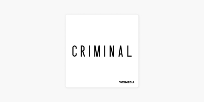
Criminal, a true-crime podcast, keeps it clean, concise, and simple. One word is all it takes to convey what the podcast is about, and create podcast cover art that is easily recognizable.
Language
The kind of language you use on your cover art will play a large part in your podcast’s visibility in each directory. Specifically, the use of explicit or adult language.
To put it simply, no major platform allows explicit language or references to crime or hard drugs. If either of these plays a large part in your brand persona, censor them.
Kara Loewentheil’s UnF*ck Your Brain makes use of the widely accepted asterisk to censor her podcast’s name, while the imagery conveys Kara’s confidence and desire to share her wisdom with her audience.
Imagery
Much like with language, your first concern is to be compliant with directory requirements for cover art. That means that explicit imagery and references to drugs or crime are out of the question.
You want your podcast to stand out, that means staying away from cliche images like mics, headphones, or speakers — unless you are actually talking about these sorts of things. Yes, podcasts about podcasting do exist.
Instead, stick to design elements that tell what your podcast is really about.
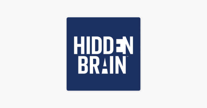
NPR’s Hidden Brain cleverly uses negative space to showcase how unconscious patterns shape our understanding, which is exactly what the show focuses on.
Fonts
It doesn’t matter whether your chosen font is bold and crisp, or decorative and stylized, what’s key here is that it is easy to read — even at the smallest font display sizes of your cover.
While playful fonts are better used when they help convey the theme of your podcast, using simple sans-serif fonts are easier to read and typically the safer choice if you want clean-looking podcast cover art.
There’s no denying that the jagged, unnatural lines that make up the title on the Scary Story Podcast cover are often associated with fear and evoke an unnerving, spooky feeling.
Spacing
If you don’t have a graphic design background, you might not realize just how important spacing is. Proper use of white space is what differentiates clean and easy-to-read podcast cover art from a jumbled, cluttered mess.
Make sure your podcast design is readable and organized so that audiences can quickly get the gist of it and hopefully feel compelled enough to press play.
If you’re not hiring a designer for your graphics, then try to keep things simple with a design tool that has templates like Canva. Avoid cramming in too many words or symbols, as this can make your cover look cluttered and chaotic.
You should also take care to avoid placing artwork elements at the bottom fifth of the image, since the play progress indicator and buttons may obscure them.
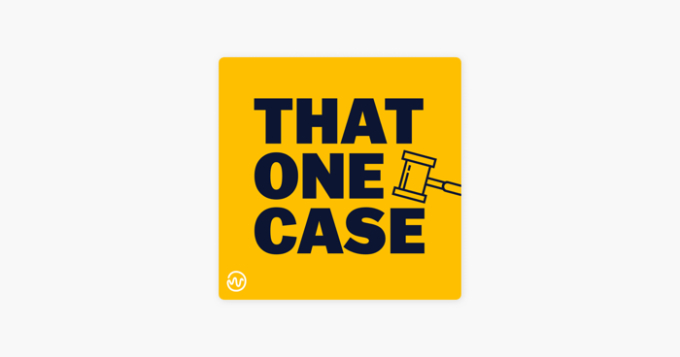
In our very own podcast, That One Case, we use a gavel to not only reinforce the law theme but to fill the space that would otherwise leave the centerline off balance. Combined with the bold font, the gavel creates a square within the square, and draws the eye to the center of the artwork.
Optimize for Mobile Screens
It is important to have visually appealing cover art that is easily readable on small screens. Regularly test your podcast cover on various mobile devices and apps to ensure it looks great in the environments where your audience will most likely encounter it.
The percentage of U.S. podcast listeners who listen to their regular podcasts on mobile is 70%, according to Cumulus Media.
Branding and Logo Design
When creating your podcast cover art, there are two scenarios where branding comes into play:
You’re making a branded podcast: As mentioned above, if your podcast falls under a larger brand you have to stay true to your brand’s design language. That can be achieved in several ways but usually involves using the same logo and design elements.
Your podcast is your brand: If you’re not beholden to a larger brand, then you’re free to innovate and go for whatever artwork suits your fancy. However, keep in mind that said choices will become associated with your podcast, so give it some thought.
Gatorade’s The Secret to Victory cover art not only matches existing branding, it also enhances the brand persona.
At a glance, we see a scoreboard, which ties to the brand’s niche, as well as Gatorade's logo. Furthermore, the title itself works to enhance Gatorade’s brand, suggesting Gatorade is “The Secret To Victory.”
Colors
Depending on your particular situation, you might not need to think about colors at all. If you’re making a branded podcast, then sticking with the brand’s color palette or scheme is the way to go.
However, if you’re just starting out, then you have endless possibilities, which can easily turn overwhelming.
If you’re not sure what to use, then consider that colors that stand out and contrast with each other can help you design a cover that is more appealing, while also making it distinctive from other shows.
You may also want to give some thought to color psychology, and whether the emotions and meanings often associated with your chosen colors resonate with the themes of your podcast.
When it comes to clever use of color, NYT’s The Daily gets it right. Simple yet effective, the color fade is suggestive of the sunrise, triggering the association many of us have with getting our daily news first thing in the morning.
Don’t Forget Dark Mode
Make sure to test your design against a dark background and ensure it looks appealing across different color tones. Podcast directories often switch to dark mode at night, with a black or gray background
Hire a Professional Designer
You could outsource the task to a freelance graphic designer for a polished and professional look for your podcast cover art.
They have the expertise and creativity to bring your vision to life, ensuring that your podcast cover stands out in a crowded market. By collaborating with a skilled designer, you can benefit from their specialized knowledge to designing your podcast cover art that captures the essence of your podcast.
Include Social Proof
To enhance credibility and attract new listeners, subtly incorporate celebrities, awards, or network affiliations in your podcast cover art.
For inspiration, take a look at the podcast Red Handed, which has won the British Podcast Awards 3 years running and incorporates the award's laurel leaves in one corner of the design.
Ensure that these social proof elements are balanced with the overall design and do not overpower the main elements. Consider adjusting the sizing when designing your cover art to avoid interfering with the rest of the design.
The Bottom Line
If you do things right, your cover design can be a huge asset for bringing in new listeners and creating a powerful, recognizable brand. However, you shouldn’t let making the perfect podcast artwork get in the way of launching your new podcast. Your podcast cover art is important — yes, but ultimately the focus should be on the show itself.
Aim for something that’s clear, easy to understand, and that caters to your target audience. Once you have the podcast cover design down, be sure to follow directory specifications and you’ll be off to the races.

![Blog vs Podcasts: Which is Best for Business Marketing? [2026]](/img/containers/main/img/hero-blog-vs.-podcast-1640267450.jpg/3b30a138cc11e6c5812f35cbb2626d16/hero-blog-vs.-podcast-1640267450.jpg)

